“Make it simple, but significant!” – Don Draper
The Creative Process for a Bid Cover for an RFP >
1) Creative Brief
The creative brief starts the ball rolling. Not all creative briefs are the same, however, they usually contain the clients name, Information about the client and the type of work that is required (bid covers, posters, brochures, video, presentations etc.). The type of branding is also important when considering the creative brief. Does the client require hybrid branding? Is this deal a partnership between two companies? What kind of iconography/imagery is expected? What are our Win themes?
3) Create Drafts
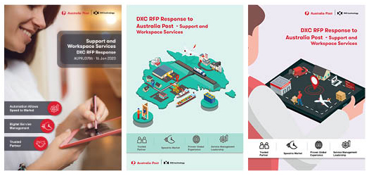
You can’t always get from A to B in one leap. Sometimes it takes a couple of wrong turns before you arrive at your destination. The first draft might not be the right one, but it can lead you in the right direction. I normally give my clients 2 – 3 rough drafts to choose from. This way I am not spending all my time on a single design that the client my not even like. I can create a pathway to the final design by giving the customer a visual idea of the style and creative direction. The client can then tell me what they like/don’t like in the design.
2) Research and Plan
Additional research may be required. This stage is where I can research the client and gather information. Understanding your customer and their needs is important in design. What are the clients objectives? What story do we want to tell our client? What story does the client want to tell to their customers?
Sometimes I must work on multiple projects and my time management is highly important, creating a plan of action, I allocate a set amount of time to complete each task before the deadline. This way I can keep track of my progress and know how much time I have to spare on each project.

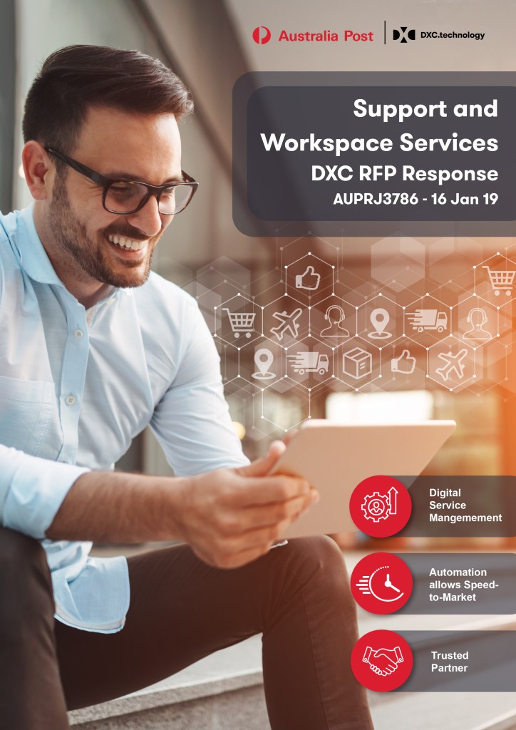
4) Finalise
It is time to finalise the design. Make the changes as the client has asked. Put in the final touches. If necessary ask for second opinions from work colleagues and make sure the design works from a user/customer perspective.
Example
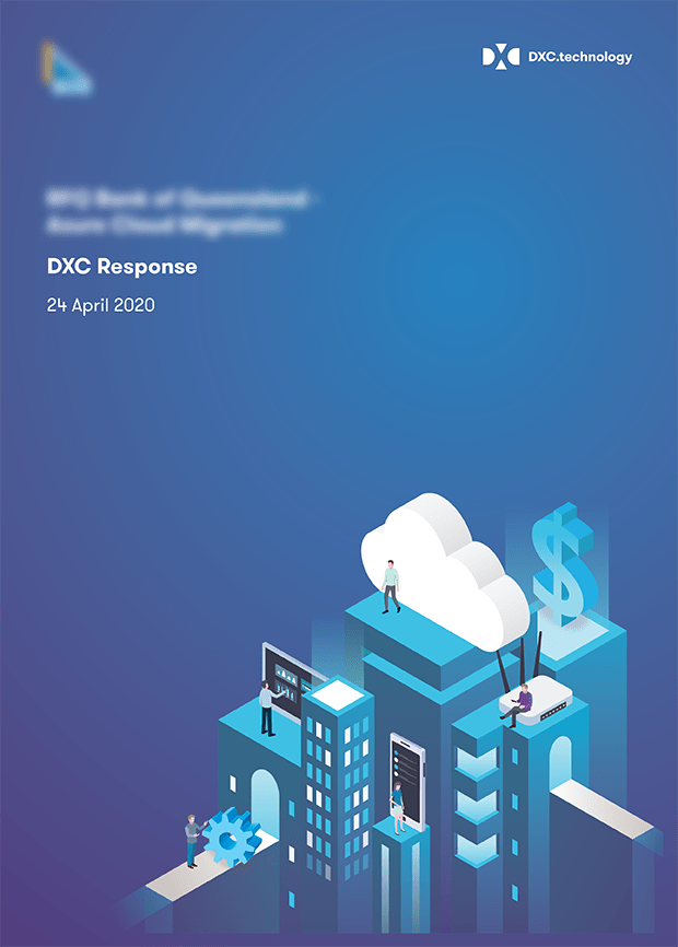
The client had a blank blue gradient for their annual report. Familiarising the customer and creating a visual story is my job as the designer. Through this design I wanted to show the customer that we had done our homework. We knew what they wanted and we had the ability to deliver results. Having a slightly similar design to their annual report showed them that we did our research and we knew their future intentions. This also had the dual purpose of making the customer feel comfortable with the ideas we were putting forward. By using similar colours and styles to their own brand they would feel less like a foreign company is trying to sell them something and more like the partners we were trying to become.
Our solution was through the cloud and involved digital transformations and came with cost benefits which I conveyed all through the subject matter on the front cover. The buildings I found as a vector graphic on Adobe Stock, I then changed the colours, added elements of our solution and voila! This of course is a broken down version of the process but you get the gist.
If you would like to see more of my portfolio please click here.
